White Label Mobile App
TL;DR
Using the content created by Rehuman’s CEO, create a white label mobile app, utilizing gamification to track users’ progress, creating a supportive experience to help people form and maintain meaningful connections and relationships.
What is Rehuman?
Rehuman is a business that aims to solve the problems of human disconnection by giving users the tools to meaningfully connect both with themselves and others. They aim to provide their clients with a thoughtful, culturally astute, brand-compatible and scalable app frame.
The Challenge
Rehuman needs an engaging mobile app to support users as they initiate, build, and maintain connections with their friends, family, and community.
The Solution
A white-labelled mobile application that can be custom-tailored to each of Rehuman’s clients.
Scope:
Timeline: 3 Week Sprint
Role: User Research Lead
Platform: Native Mobile Application
Tools: Pen/Paper, Sketch, InVision, Marvel, Adobe XD
Deliverables:
Heuristics + C&C Analysis, User Persona, Sitemap, Task Analysis, User Experience Map, Annotated Wireframes, Low-Med-High Fidelity Prototypes, Clickable Prototype.
Secondary Research
We looked at studies to understand how Rehuman’s mission is relevant in today’s always connected culture, and we found startling numbers.
“Loneliness is deadlier than diabetes, a 2015 analysis showed, raising the risk of heart disease, stroke, and cancer
“As many as 80 percent of people under the age of 18 report feeling lonely some of the time”
“The chronically lonely include between 15 and 30 percent of the general population”
Competitive and Comparative Analysis
We took a step back before doing any design or user research, and saw the potential for the app to help users build new habits to maintain their connections. It was important to familiarize ourselves with how other apps incentivize maintaining habits.
Some of the key takeaways:
All apps included incentives of some kind, either badges for progress, some even monetary
There was a timeline so users could see their history at a glance
Bottom navigation bars were very common, and used for their simplicity
Surveys and Interviews
We conducted surveys and interviews to better understand how technology keeps users connected with the people they care about. We used affinity mapping to discover patterns in the data. There were a total of 48 participants.
Technology allows users to connect easily with people who are far away.
Technology serves as a tool to facilitate offline connections. The online connection was only a means to an end.
Many users met someone online who later became significant.
Many users were trying to be intentional when using technology, but don’t keep a hard count of how many hours they use their phone per day.
Many used reminders for everyday things, and the calendar to schedule their lives.
Most users did not use reminders or notifications to reinforce a new habit
User Persona and Journey Map
Alice was created to create empathy for our users during the design process. She’s new to Los Angeles from the midwest to highlight how hard it is to make new connections in a large city.
Alice wants to join clubs and become more involved, so she goes to a club event at the beginning of the year. She’s nervous to approach new people, and to cope uses her phone as a crutch. She messages an old friend, but they aren’t online. Her phone then locks her out, a setting she’s set to keep her from being on too much, and then she decides to leave the event.
In the end, she didn’t really get the support she needed to reach out offline, and feels defeated.
The Redefined Problem
Alice needs support and guidance while maintaining current connections and making new ones both online and offline.
How might we make an app that gives her the tools she needs that allows her to see and feel her progress along the way?
Our Unique Offer
We want to help Alice feel confident in her connections, both old and new, by creating a compelling app that gives her unique tasks, everyday.
…and we are different from our competitors because we incorporate detailed, encouraging curriculum and create a digital space for her to note her progress.
We will know we have achieved success because the number of users who use the app everyday will continue to increase.
Feature Prioritization
By considering the product/market fit, pinpointing the problems, and identifying our goals, we were able to prioritize features for our app design using MoSCoW methodology.
We decided the app must be white-labelled, have tailored content and track user’s progress through the content.
Information Architecture
Organizing an app with room to grow:
Taking what we learned from card sorting and competitive analysis, we decided a 4 tab bottom navigation was the best option.
We also knew the app would need to be scalable, as the content for the app will always be growing and differ depending on the context of each Rehuman client.
The exercise cards, the detailed view of growth for each level, along with resources and information must be able to expand as needed. There’s no cap on how many of these pages could be built into each iteration.
Paper Wireframes and Lo-Fi Testing
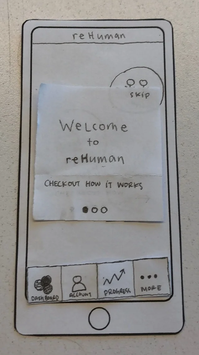
We used a collaborative design studio to create our first wireframes and paper prototypes. Our design lead, Cheryl, came up with the idea of visualizing the different social circles we engage with most often with animated, overlapping circles, one for each group: Family, Friends, and Community.
Users would be asked how connected they felt with each group as a way to self-report during onboarding and at the end of every level.
Our paper wireframes were imported into Marvel for testing.
Major Findings from Paper Prototype Testing:
Users experienced confusion around a few CTA buttons
Users wanted a better understanding of why they were completing self assessment questions
Users were split on the idea of receiving notifications to remind them to use the app
Implementations for next iteration:
Inclusion of a splash page to inform how the questions tie into their long term goals for personal growth
Clarification using iconography and text
Option to have notifications and customize reminders
Mid-Fi Wireframes and Prototype Testing
Next, we digitized our wireframes in Sketch and created a medium fidelity prototype using Adobe Xd to better communicate the intended functionality of the app.
Major Findings from Mid-Fidelity Testing:
Users liked the clean visual design
Still some confusion about wording and gestures
A little difficulty understanding the direction of a few CTA buttons
Implementations for High Fidelity:
A modal to prompt users to reassess at the end of each level.
Users preferred "Home" to "Dashboard"
Arrows added to some pages to assist navigation.
Staying True to Rehuman’s Vision
Before crafting the high-fidelity prototype, our team checked in with the team of stakeholders. There were several features they wanted incorporated as a result of the meeting:
Addition of an introductory video during onboarding
Ability for users to bookmark favorite exercises
Inclusion of a journal for users to add notes at the end of each level
The Rehuman team also wanted us to incorporate their branding as part of the prototype to demonstrate where their clients would be able to incorporate their own branding in the future.
High Fidelity Wireframes and Prototype
We were given a basic branding guide that included the Rehuman colors and fonts and incorporated them into the final hi-fi prototype, but all colors and logos could easily be changed to suit each Rehuman client.
Animations were fine-tuned to allow a smoother experience for testing and to provide final specifications for development.
Hi-Fi Animations:
Findings from Hi-Fi Prototype:
Users found the iconography throughout the app easy to understand
Some users still wanted clearer navigation within the 3 self assessment questions
Implementations:
Incorporate a "next" button into the slider onboarding questions
Incorporate a tab at the top of each reflection page that takes users to their personal notes
Next Steps
Deliver annotated wireframes for development
Test proposed content with potential users
Adjust graphics, color, typography, and content as needed to suit Rehuman clients
Incorporate the Goals feature into onboarding process, allowing it to potentially tailor content for an individual user


