TL;DR
Created a mobile app to navigate a magical, safe autonomous public transit system through user research, prototypes and usability testing.
What is Loop?
“Loop is a high-speed, underground public transportation system in which passengers are transported via compatible autonomous electric vehicles at up to 150 mph.”
-The Boring Company
Passengers travel to their final destination without stopping via a network of primary and secondary tunnels.
Pedestrians will have access to vehicles built on an extended version of the Tesla Model X chassis that will hold up to 16 passengers each. Each station could be as small as two parking spaces.
The Challenge
The Boring Company needs to develop a way for users to easily ride their new transit system.
The Solution
Develop a location-based mobile application that allows users to find, schedule, and complete their ride on a dynamic transit system.
Scope:
Timeline: 2 Week Sprint
Team: Myself, Iris Minji (Head of Design) and Carissa Gabilheri (Head of Research)
My Role: Project Manager
Platform: iOS
Tools: Pen/Paper, Sketch, InVision
Deliverables:
Heuristics + C&C Analysis, Persona, Sitemap, Task Analysis, User Experience Map, Wireframes, Low-Med-High Fidelity Prototypes, Clickable Prototype.
Competitive and Comparative Analysis
Researching the competition, we analyzed features of alternatives to Loop, such as Metro, Uber, and BART, and gathered information on mobility apps to learn what users may expect to find in an app for Loop. From C&C, we discovered some apps were much easier to use than others, and almost none included any way to pay for or reload a pass for a transit system via the app.
All did include fare information, save for LA Metro, and most included an easy way to report safety hazards or emergencies via the app or linked phone number. We also noted all of them had real-time system updates.
Heuristic of LA Metro’s mobile app
We also performed a heuristic on the current LA Metro app to learn what works well and further understand its scope.
Major Findings: Payment information was non-existent on the mobile app, and the one link redirected to a corporate purchasing program. Users were on their own once they arrived at the station, there was no way to interact with the train system beyond arriving on time.
Secondary Research
We looked at two recent surveys from LA Metro, which gave us a cross-section of 18,000 current riders in the LA metropolitan area.
65% of riders use a transit app on their mobile.
29% of riders have experienced harassment.
Major Findings: Most riders have a smartphone and are already using it to help their use of public transit. Riders are using a system that has significant safety issues.
Surveys and Interviews
We conducted 9 user interviews and received 30 survey responses to gain insight into the feelings and current pain points of public transit in Los Angeles.
“Public transit currently sucks, it needs to be fixed before I’ll use it.”
Users wanted transit to feel cleaner and safer.
Users wanted less crowding on buses and trains.
Users wanted to be able to plan and pay for their trip entirely on their phone.
Users felt public transit didn’t fit their needs.
User Persona and Journey
Tina Transit was created to create empathy for our users and easily focus on the pain points they encounter while using the LA Metro. We chose to make her well educated and female in order to focus on the priorities of safety and comfort while creating the mobile experience for Loop.
“I got to the station, but my TAP card doesn’t work. I need to add money, I hope I don’t miss my train.”
Tina is able to successfully find the nearest Metro route, and get to the station on time. However, the app leaves her hanging. There is no way to add fare to her TAP card in the app. Instead, she must wait in line for a kiosk to reload her card, and she misses her train despite being on time.
The Redefined Problem
Tina Transit needs efficient, cost-effective, and safe public transportation.
How might we create a magical, seamless option for her to utilize everyday on a brand new autonomous transit system?
Our Unique Offer
We want to help Tina Transit solve the problem of an inefficient commute by creating a seamless, modern public transit experience.
And we are different from our competitors because we utilize a brand new transportation network.
We will know we have achieved success because ridership will increase exponentially and cities will be easier to navigate.
Feature Prioritization
Based on the needs of our users, we prioritized mobile payment, real-time system information, location services, and emergency services. We wanted users to be able to skip the kiosk and feel that Loop was safer than other forms of transit.
Information Architecture
We created an open card sort to understand how users might sort the features we planned for the first version of Loop. This led us to the following sitemap for the mobile app:
Users are able to find everything to request a ride from the map landing page, including any directions to and from Loop stations.
Settings for rider profile, payment, along with quick access to safety services and customer service can be found under a global hamburger menu.
Design Studio, Paper Wireframes and Lo-Fi Testing
The team used a design studio to iterate designs for agreed upon features from our research synthesis.
Iris, our team’s design lead, took these whiteboard sketches and created our first paper wireframes for Loop. I linked them together to create a digitized paper prototype in Marvel so we could test the design separately and have a consistent prototype for the 3 of us to test.
Carissa, our research lead, compiled a set of post-test questions for users about usability, and the same questions were asked at the end of every test at all fidelities.
Major Findings from Paper Prototype Testing:
Originally, we gave users just one ride option in the immediate future, but users wanted to see multiple ride options to better plan their day. It was clear that we were not going to be able to change the users mental model surrounding public transit on the first iteration.
Users wanted more detailed walking directions.
Users want to rate their ride after arriving at their final destination, and some were confused as to why they were rating a public transit app.
Users wanted to swipe up to see the ticket, and not see a large button. They also wanted the ticket to use QR, not NFC.
Users needed more visual hierarchy, the greyscale prototype was hard to follow.
Mid-Fi Wireframes and Prototype
In order to address our users comments about confusion while using the paper prototype, we decided it might be advantageous to make a higher fidelity set of digital wireframes for the second iteration. We did not emphasize attention to detail on the smaller details of the UI (spacing, shading, consistent icon styles), and focused on functionality. Users also were unsure as to what Loop is, so we also created a splash page to explain how Loop works and a signup flow.
Good news: Most users found this prototype easy to figure out.
Major Findings from Mid-Fi Prototype Testing:
Users want to be able to change payment options (change credit card, Apple Pay) when confirming ride.
Departure page needs clear directions.
Users want a tutorial for the Loop.
App needs to look consistent throughout.
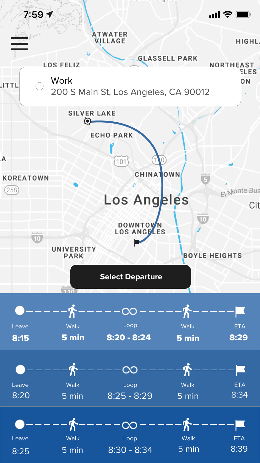
Need clear times for walking and time to leave on the “Choose Departure” page.
Ticket needs to be easier to find through a new interaction.
High Fidelity Wireframes and Prototype
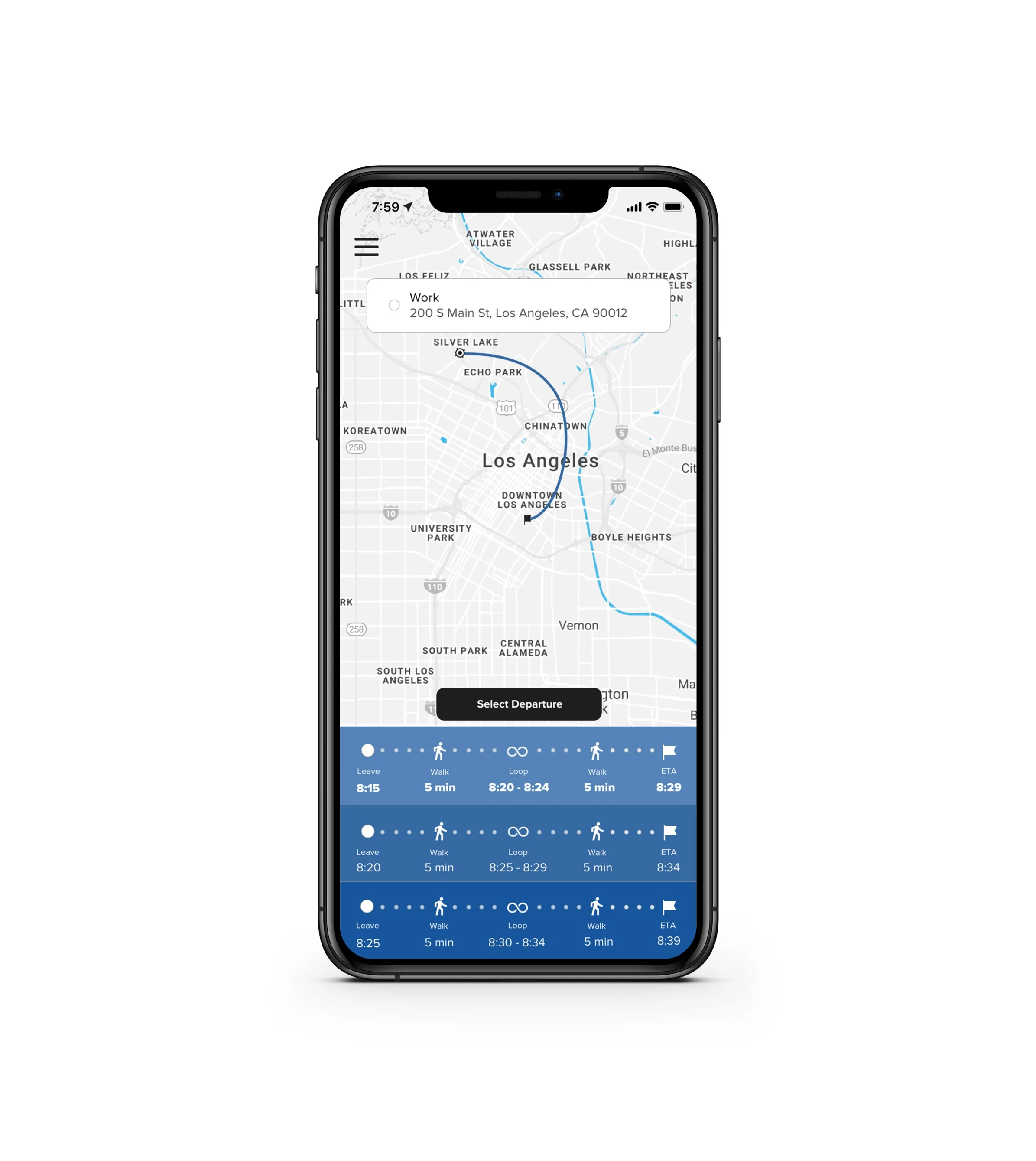
During the creation of the high fidelity wireframes, 5 iterations of the “Select Departure” page were created. We finally settled on the last iteration, employing dots to signify the journey in a single line format. We wanted users to understand the full journey they were choosing. We still believe that it requires more testing and fine-tuning, but testing proved it was clear enough.
The entire app’s UI was overhauled, curves were added everywhere, and most hard corners were eliminated from input fields and icons.
The map was also changed to a blue color scheme that better matched the Loop branding.
We simplified the ticket, and made it easy to access while viewing walking directions to Loop.
The “Select Departure” went through many iterations while creating the high fidelity prototype.
Users enjoy using the app!
Findings from Hi-Fi Prototype:
They wanted the whole prototype to work.
Users had some aesthetic and hierarchical comments to further improve the overall user experience.
Next Steps
Further iterate to evolve the user’s mental model of a transit system that dynamically changes according to demand over several future versions of the Loop app.
Continue to work with the Loop engineering team to collaborate on the physical experience.
Update with information as the system is built, taking into account any changes that occur during the development of the physical experience.


