E-Commerce Website Redesign
TL;DR
Redesign Booksoup’s e-commerce website to bring it in line with modern website conventions through research, rapid prototyping and user testing.
What is Booksoup?
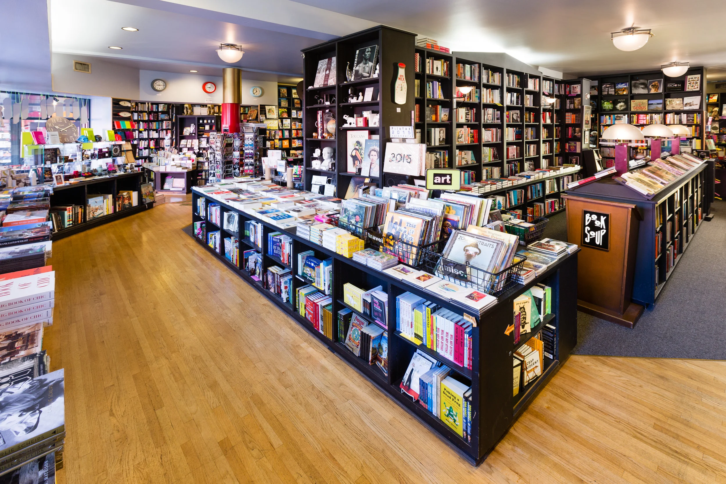
Booksoup is a fiercely independent bookstore in Los Angeles. It’s located on Sunset Boulevard, and hosts many A-list author events on a regular basis. It was founded in 1975, and it’s an institution in Hollywood.
The Challenge
Booksoup needs a new, user-centered design for their e-commerce site.
The Solution
Complete generative and evaluative user research and create a re-design for booksoup.com
Scope:
Timeline: 3 Week Sprint
Role: UX Designer
Platform: Web
Tools: Pen/Paper, Sketch, InVision, Tree Jack
Deliverables:
Heuristics + C&C Analysis, Persona, Sitemap, Task Analysis, User Experience Map, Wireframes, Low-Med-High Fidelity Prototypes, Clickable Prototype.
Competitive and Comparative Analysis
I completed a full C&C analysis of Booksoup against Amazon and Barnes & Noble to learn what features Booksoup might emulate, and found many opportunities. Amazon and Barnes & Noble both include personalized recommendations and user generated reviews, and easy, clickable links on the homepage to bestselling and popular titles. Booksoup had a bestsellers list, but it wasn’t clickable and lacked thumbnails. There were also no user reviews or recommendations.
Heuristic of Booksoup’s current site
I also created a full heuristic report on the current Booksoup site to learn what areas of the checkout process users might be having trouble with.
Major Findings: Users are unable to click on the titles of the bestselling books on the home page. This forces users to search for a book, and while performing the heuristic, there were several titles of the same name listed, and each format of each title had a separate listing in the results page. This could lead to confusion for users.
There were also issues sitewide with UI, such as grey CTA buttons throughout the site, hard to read header typefaces and backgrounds, and small thumbnails which hampered visual recall of book covers.
Evaluative Research
After my heuristic, I wanted to see where users might be getting stuck on the current site. I assigned them the following task flow:
Major Findings: All users expressed frustration about the bestsellers list. All of them assumed the bestsellers list was comprised of hyperlinks, but were unpleasantly surprised to discover they had to search for the title to find it.
Even then, many users backtracked to make sure the title product page was the correct one. This greatly hampered efficiency in using the site. Less than half of the testers felt very confident their order was going to be fulfilled correctly.
Surveys and Interviews
I conducted 3 user interviews and received 9 survey responses to gain insight into users’ goals while shopping for books, both online and in-store to see if habits were different in any way. I uncovered the following insights, and realized there might be potential to bring the feel of a local bookstore online.
Users love books!
Users like to browse and discover books in-store, but like to quickly find what they’re looking for online.
Users like buying online for the ease and low prices, and most want fast, cheap shipping.
User Persona and Journey
Betty Bookworm was created to create empathy for our users and easily focus on the pain points they encounter while using the current Booksoup site to buy a bestselling book. She’s creative, well educated, and motivated, all traits shared by the users interviewed or surveyed.
Betty is able to find the bestsellers on the homepage but is surprised to find the list is not comprised of hyperlinks. She’s forced to search for the title. When she does, there are several different books with the same name, leading to confusion and forcing her to backtrack to verify she has the correct book.
Even after placing her order, she still does not feel confident that her order will be correct.
“I’m very frustrated I can’t click on a link in the bestsellers list and the only workaround is to search for the title. It’s so much wasted effort.”
The Redefined Problem
Betty Bookworm needs an easy way to browse and purchase books online from a local bookstore.
How might we create an enjoyable, easy-to-use online bookstore that allows her to discover her next favorite book?
Our Unique Offer
We want to help Betty Bookworm solve the problem of purchasing bestselling books by creating an easier to navigate shopping experience
...and we are different from our competitors because we will bring the best parts of a local bookstore experience online.
We will know we have achieved success when we have increased book sales.
Feature Prioritization
Purchasing from Booksoup should be just as easy and friendly online as it is in-store. The new site should be a clean design that allows for either leisurely browsing or efficiently finding a particular title. There will be staff recommendations to bring the retail store online, and a possible rebranding of their subscription service.
Information Architecture
Since the first task was designing a way to browse the titles Booksoup offers, I turned to card sorting to learn how users expect to see books. I quickly learned that there are too many types of books and users might not always know a particular title, so the card sort quickly proved ineffective. The one finding from card sorting: Users liked seeing books by local authors in one place.
Instead to turned back to C&C Analysis, and looked at how large competitors organize their browse menu.
C&C of Global Navigation:
Found most competitors allowed for browsing by genre, and did not want to reinvent the wheel. Created a navigation system that followed conventions of having popular genres available readily, while less popular categories were found quickly under another nearby secondary navigation dropdown.
Tree Testing:
In order to test my idea for a new navigation schema for the extensive catalog of books, I created a tree test to make sure the ideas I had were simple and easy for users to find something specific quickly. I followed the conventions that libraries and booksellers already use.
The tree test had 3 tasks which users quickly completed. It had a 93% success rate with 10 testers.
Mapping the New Site:
The old sitemap for Booksoup did not allow for easy browsing of books within a genre. The top navigation did not have categories of books that many users might expect, and there were only 4 tabs at the top that led users to a product detail page.
Using the strong results from the tree test, I created a new proposed sitemap for Booksoup, where there would be a listing page for each genre found in the secondary dropdown menu. I knew in addition to creating a new home page, there would need to be a template of some kind for these new genre listing pages as well.
A closer look at the new Browse menu that allows for multiple pages for each subgenre and can be expanded as necessary. There are now many different ways to end up on a product detail page than before.
A closer look at the new Browse menu.
Sitemap Key:
Paper Wireframes and Lo-Fi Testing
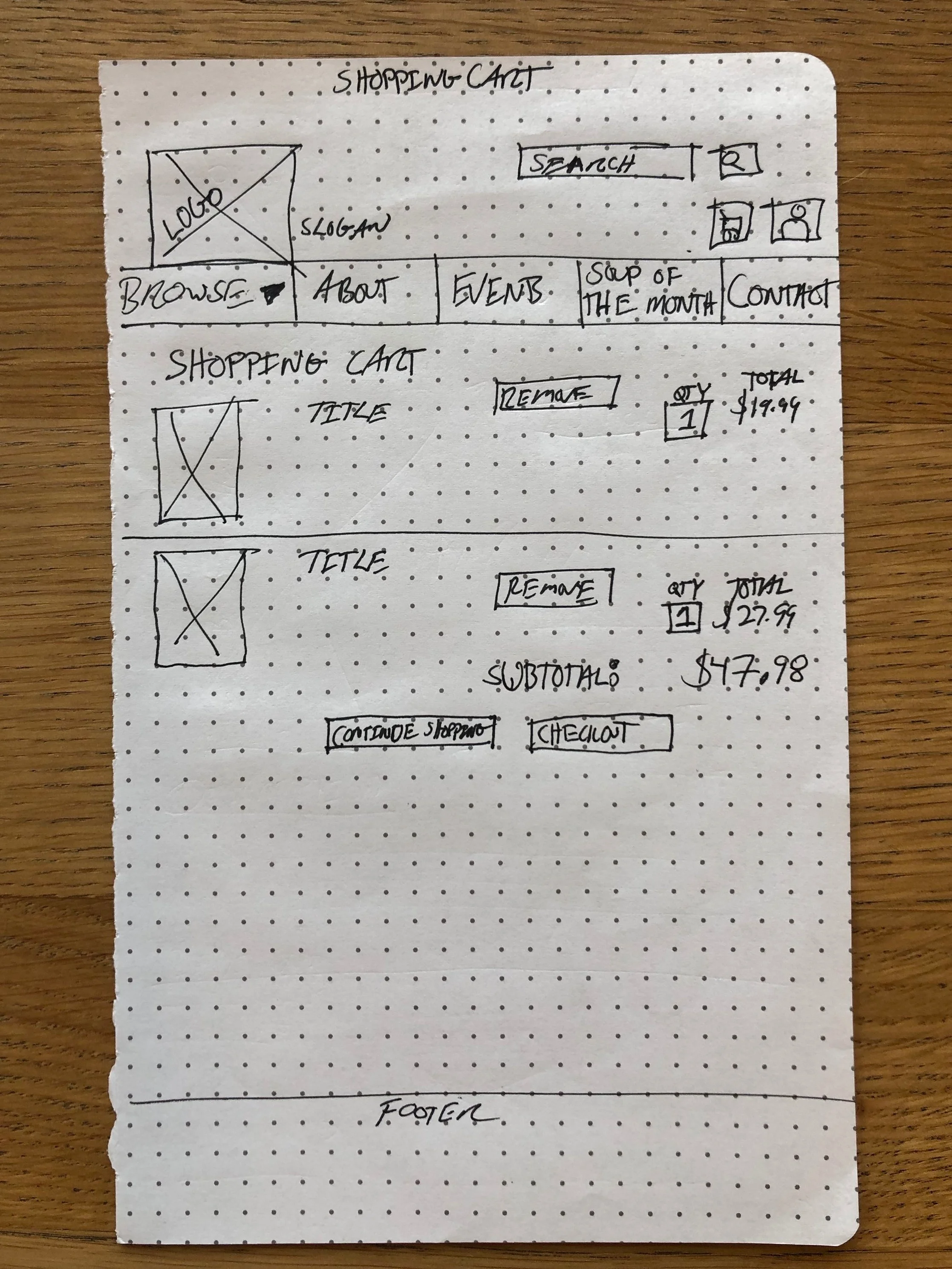
Using the information architecture and the list of features, I made a set of paper wireframes. I used an idea for a new possible name of the book subscription service, and made several iterations of the global navigation. At the end of each test, users were asked what they thought the name in the navigation meant.
The paper wireframes were turned into a prototype where I incorporated the use of dropdown menus and popup modals via post it notes and smaller pieces of paper.
Major Findings from Paper Prototype Testing:
Users intuitively clicked on the thumbnails to get more information.
Users wanted clearer buttons on the checkout pages.
Users wanted a grid view for easy browsing of listing pages.
There was a lot that worked in the first paper prototype, but users needed better button placement.
Mid-Fi Wireframes and Prototype Testing
Moving on to the mid-fi wireframes, I only incorporated color in the use of buttons to make sure they were prominent for users during testing. I made sure they were the same size to make them consistent.
I imported the files into InVision to make the first digital prototype, where the browse menu was also operational for users to see how many would use it.
Major Findings from Mid-Fidelity Testing:
Users were comfortable exploring the dropdown browse menu.
Users wanted scrolling minimized in the checkout process.
Most users selected a bestseller from the homepage directly.
Users didn’t like being redirected to the cart automatically, they wanted to spend more time browsing.
High Fidelity Wireframes and Prototype
Wanting to incorporate color and branding into the new site, I took inspiration from Booksoup’s Instagram account and made a mood board and corresponding style guide. I wanted to incorporate some of the feel of the physical store’s experience by using the colors they were already using on their social media accounts.
In an effort to keep the focus on functionality, placeholder images were used instead of actual books throughout the high-fidelity wireframes.
Hi-Fi Wireframes:
Findings from Hi-Fi Prototype:
Once users entered the checkout process, they flew through it very quickly.
The arrows on the carousels were changed to white because black no longer showed up well once placeholder images were placed.
Users commented they wanted to see color in the star ratings, so that was changed to gold.
The cart modal that appears after adding an item to the cart received great feedback along with the checkout progress bar.
Easily be able to see in cart if there was a mistake with the inclusion of thumbnails.
Next Steps
Deliver annotated wireframes for development.
Continue to design and iterate through the development process and beyond.
Potentially connect with staff at Booksoup to implement service-side changes as needed to further complete a seamless, omni-channel user experience, end-to-end.


